The Meaning Behind the Brand and Logo
Every element of DeepFake This™ is intentional. The brand’s identity is anchored by its wordmark, while its supporting visuals serve as a conceptual backdrop — reinforcing themes rather than defining ownership.
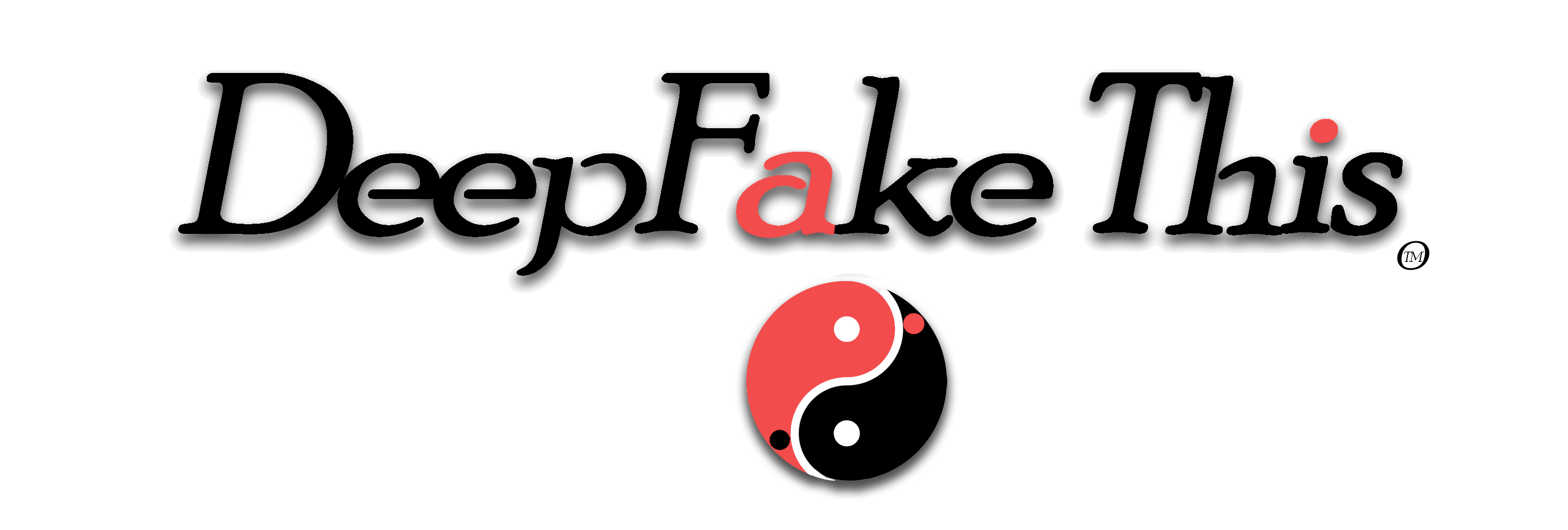
The most distinctive feature of the DeepFake This™ wordmark is the reversed “a”. It’s subtle enough to go unnoticed at first glance, yet unmistakable once seen. That delayed recognition is deliberate.
The reversed letter reflects a familiar modern sensation: the moment something appears authentic, but feels slightly off. It echoes how digital media often presents itself — convincing, polished, and quietly distorted.
This is not a trick or an attempt at deception. It’s a pause. A visual cue that invites reflection.
Why alter a single letter?
Because in today’s digital environment, meaning is often shaped by small deviations. A minor edit, a recontextualized image, or a synthetic voice can shift perception without drawing attention to itself.
The wordmark acknowledges that reality symbolically. It suggests: you recognize this — now look again.
The supporting circular motif used throughout the site reinforces this idea visually. It represents contrast, balance, and coexistence — real and artificial, signal and noise, truth and interpretation.
Neither element stands alone. Together, they form a visual language rooted in awareness rather than instruction, commentary rather than technique.
The DeepFake This™ identity is designed for those who value subtle intelligence, cultural literacy, and the ability to sit comfortably with paradox.
The logo isn’t camouflage. It’s a signal — a deliberate imperfection that rewards attention.
Wear it, display it, or encounter it, and the message is the same: notice more.